Design and UX of dashboard #257
Comments
|
Woah, thanks for taking the time to create mockups, they look great!
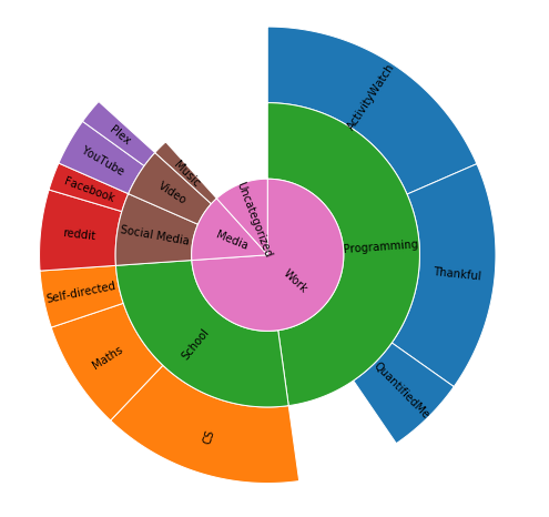
Agreed! This has been discussed extensively in this issue: #95 I've done a lot of experimental work which includes tagging and categorization, and new types of visualizations, see specifically this notebook. I haven't included the output plots in the notebook for privacy reasons, but they are very useful (although not amazing-looking design-wise). I feel like I need to show you one plot though, so here's the sunburst visualization used in the notebook, the data used to generate it is fake but it was categorized with the same tagging system as used in the notebook:
Do you find that to be an intuitive way to show the user how they've spent their time across different projects/apps/websites?
The data processing going is actually a tad bit more advanced than a simple database query and grouping. Due to our watcher-based architecture there's a decent amount of preprocessing going on with merging events from different sources (such as window, afk, and web) with each other. If you're interested the queries are here. One feature that's highly requested is an daily/weekly/monthly/yearly overview (as discussed here: #189). This is something I've already built in the notebook I linked above, but how to get it done in the web UI remains. For reference, here's the plot of the time I've spent on ActivityWatch over the past 2 months (not counting the quantifiedme notebook):
I agree, and that's great! But I'm pretty busy right now (:disappointed:) so wont have time to work on this for a while, but we'll get it done eventually, just not in the next few months. What we'd need right now are more mocks for a revamp of the web UI. If you could mock how you think the the web UI should look (with a light color theme, even though your dark mock looked great) that'd be really helpful! |

|
Having some user-customizable interactive graphs would be great. I'm thinking of plotly-dash. |
|
First time commenting, love this project and love that you're implementing python--thank you all for your hard work! Considering one of your main missions is have enough access to the raw data now so that they can ask better questions in the future, it would be good if the interface accommodated user-entered tags as it's primary function. For the interface, I would want to adjust it so you have some place-holders as examples like "most browsed", "top 5 apps", "least used" and so on. There should be a
The more I think about it, having an easy way to manage meta-data in your program could make it much easier to enable many more features than this, while giving more intuitive control to your users. |
|
This issue has been automatically marked as stale because it has not had recent activity. It will be closed if no further activity occurs. Thank you for your contributions. |
|
@Stale this issue isn't stale. |
|
@jtrakk But it is, because nobody is working on it and the ping by stalebot didn't lead to any action. Some of the features mentioned ("tagging", day/week/month view) have already been implemented in alternative ways, so the discussion is also a bit outdated. |
|
I’d say the mockup and spec is still current though? Would be nice if it’s kept open so that if someone wants to implement design improvements, they see a possible specification. |
|
To the extent that it is current anyone is still free to pick it up and work on it, but until that happens the issue will remain closed. We close stale issues keep open issues current, otherwise, we'd have hundreds open. I hope you understand 🙂 |
Is your feature request related to a problem? Please describe.
Currently the dashboard basically shows what’s in the database, just grouped by URL or file path (as far as I can see). This data is pretty raw and it would be cool if it would actually be grouped by "Project" in a way.
Describe the solution you'd like
It could be possible to group by keywords in the URL or file to identify either automatically to a certain extent (e.g. a bunch of folder paths and URLs have "nextcloud" in there, so that’s probably a project), or manually saying "these belong together", or "add this type of domain to that project.
This is a very early mockup of what a dashboard could look like which clearly and quickly shows you what you worked on (overview left, detail page right):

(SVG source and other things like design research and the Montserrat typeface in the source folder.)
/nextcloud/servervs/nextcloud/mailfor example), as well as local file paths.Describe alternatives you've considered
There’s some other variants to visualize the activity. Another option would be to have a horizontal bar which displays the whole time and is split by projects. But depending on timeframe, project slots might be small and not really clickable. Similar with a vertical bar where depending on screen size you might not see the whole bar (where then the visualization doesn’t work as you don’t know what 100% is) or entries would be too small.
As this is not only about the mockup itself but also about the way the data is interpreted I’d be really interested in what you think about it. I’ve been using ActivityWatch for some time now and like it a lot but think that for it to be immediately useful to more people, the data visualization needs improvement – I hope to help! 🙂
The text was updated successfully, but these errors were encountered: