Custom positions for axis labels/ticks #13627
Comments
|
Hi! We've received your issue and please be patient to get responded. 🎉 In the meanwhile, please make sure that you have posted enough image to demo your request. You may also check out the API and chart option to get the answer. If you don't get helped for a long time (over a week) or have an urgent question to ask, you may also send an email to dev@echarts.apache.org. Please attach the issue link if it's a technical question. If you are interested in the project, you may also subscribe our mailing list. Have a nice day! 🍵 |
|
Hi, is there any update on this? I also would need this feature. |
|
im looking for this too |
|
Hi, it would be great to have such useful feture! |
|
Yes. It is unexpected I cannot decide exact positions for my labels. |
|
looking for this |
|
|

|
Hi, is there any update on this? |
|
@praful-hunde a temporary solution: use image as Here I'm creating a canvas element for drawing image then convert it into // create canvas and resize it
const domCanvas = document.createElement('canvas')
domCanvas.width = 56
domCanvas.height = 24
// draw anything on it
const ctx = domCanvas.getContext('2d')
ctx.font = '24px serif'
ctx.fillStyle = 'red'
ctx.fillText('30', 0, 24)
// convert into dataURL
const dataurlImg = domCanvas.toDataURL()
window.dataurlImg = dataurlImgchart option: preview:
not looks very good, but it just works for some cases (at least my case). |

|
It would be really good to have something like this. For now, when an axis is typed as 'value' with for example min: 0 max: 120, in the axisLabel's formatter callback function I just got 0,20,40,...,120 for the values. UPDATE: |

|
I was able to do this by hiding the x-axis labels and adding vertical marklines.
|

What problem does this feature solve?
I want to be able to define custom locations for labels and ticks on axes. Currently, they are always positioned monotonically based on an interval. My use case for this is pointing out interesting events, like important train stops in the below example or important events on a time-series chart (e.g. "ad posted to Twitter" on a chart of site visits).
Desired outcome:
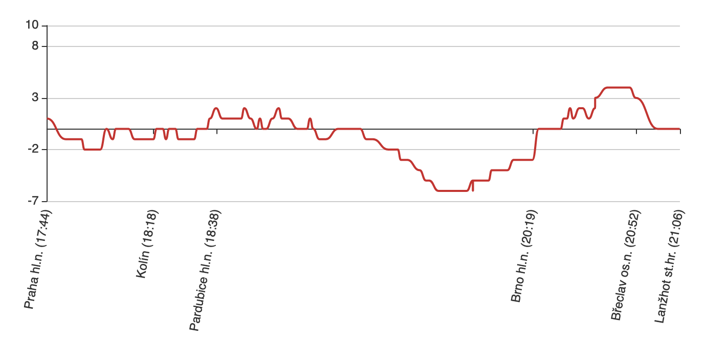
I can currently achieve this kind of effect with ECharts, but it's incredibly hacky and works by using a category axis with most category names as empty strings. (code). My objection isn't just that the code is ugly, getting the precision needed to zoom on data would require a category axis with possibly hundreds of thousands of values.
What does the proposed API look like?
The text was updated successfully, but these errors were encountered: