-
Notifications
You must be signed in to change notification settings - Fork 47
6. Efficiency
The Efficiency page provides insights for work items at Backlog level (PBI, User Story, Bug, etc). It excludes any levels higher such as Epic or Feature. Task work item type is not included in the dataset. Due to the data involved, this dataset only includes items changed in the last 6 months, which may impact the numbers presented compared to the full work item history. Similarly, if you change board column names frequently this is also likely to adversely affect the numbers presented.

This chart shows the proportion of time (expressed as a percentage) that was spent actively working on an individual item. This is calculated as Work Time / (Work Time + Wait Time) * 100. The Item ID is plotted on the x-axis against the flow efficiency percentage on the y-axis.
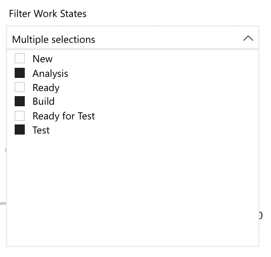
As well as this, there is a number visual which aggregates the percentage flow efficiency for all items in the range selected. The slicer to the right corner of the visual provides the consumer the ability to filter on which are the ‘work’ board columns in the team(s) process. The more orange an item is, the lower the flow efficiency is. These items are the ones to focus on in terms of root cause analysis or continuous improvement. You can get also get a breakdown of time in each board column for a respective item in the 'Time in board column' chart below.
The user needs to be aware of which columns on a teams kanban board are the ‘work’ columns and which are the ‘wait’ columns. For example, this team may define ‘Analysis’, ‘Ready’ and ‘Ready for Test’ columns as the wait (or queues) columns in their process.

Please note, the furthest right column will always be excluded due to this being when an item is finished/done.
Therefore we should make sure all other columns apart from these are selected in the slicer (as these are our ‘work’ states).

The formula will dynamically update depending on your selection. Upon opening the chart for the first time, if no selection of work states is made then a warning message will appear, prompting the user to select their 'work' states.

The intention with this chart is to see just how much time is actively spent working on items, compared to waiting. For most organisations this typically is in the range of 5-15%, meaning we spend a lot of time waiting! High performing orgs tend to only get this as high as 40%, so chances are any that is above that means you haven’t modelled queues right in your board.
When overdriven you may see your quality metric impacted as more bugs are reported due to work being done ‘quickly’ (so it flows through fast and isn’t sat waiting). Whilst a useful metric, it can be overdriven simply by becoming too obsessive over the number being ‘accurate’ - do we mark things as waiting when we finish work for the day for example as technically we aren’t working on it.
It is gamed by not having queues in your process, so everything is ‘work’ time, or by putting items only in ‘work’ states, avoiding columns that are in fact queues so that the number looks better.

This chart shows the total amount of time (in days) that items have spent in a particular board column. The slicer to the right corner of the visual provides the consumer the ability to filter on a particular work item (or a set of work items) and view the detail for those specifically. With no filtering it will aggregate (as a sum) the total amount of time spent in each board column. There is also a summary of the amount of time an item spent blocked (either using blocked fields / tags), with the chart highlighting which column this occurred in (in red).
This one is pretty simple, it is a sum of the total amount of time (in days) an item spends in a particular column on the board. If viewed for all, or a selection of items, it is the sum of time in board column for all the items together.
The intention with this chart is to identify where the bottlenecks may be in a teams kanban board and use this to inform any improvements to the way of working. In the example above, we can see that columns x and x are the biggest bottlenecks for this team (due to the height of the bars) meaning items spent most of their time in these columns.
If you could improve (reduce) that time, then you could reduce cycle times and improve flow.
When overdriven you may see your quality metric impacted as more bugs are reported due to work being done ‘quickly’ (so it flows through fast and isn’t the bars are ‘low’ for each column).
It is gamed by keeping work items in columns for short periods, potentially moving them around the board every day so that the ‘number’ remains low.