-
Notifications
You must be signed in to change notification settings - Fork 47
7. FAQs
For each Work Item table in the dataset, the amount of data is as follows:
- WorkItems Blocked - Work items changed after 1st June 2020
- WorkItems Blocked2 - Work items changed after 1st June 2020
- WorkItems Completed - Work items changed after 1st May 2019
- WorkItems Daily Blocked Count - Work items changed after 1st June 2020
- WorkItems In Progress - Work items changed after 1st May 2019
- WorkItems In Progress2 - Work items changed after 1st May 2019
- WorkItems WIP Age - Work items changed after 1st June 2020
For publishing to Azure DevOps, follow the steps in this blog.
To share with those without Power BI Desktop, use the print to PDF option.
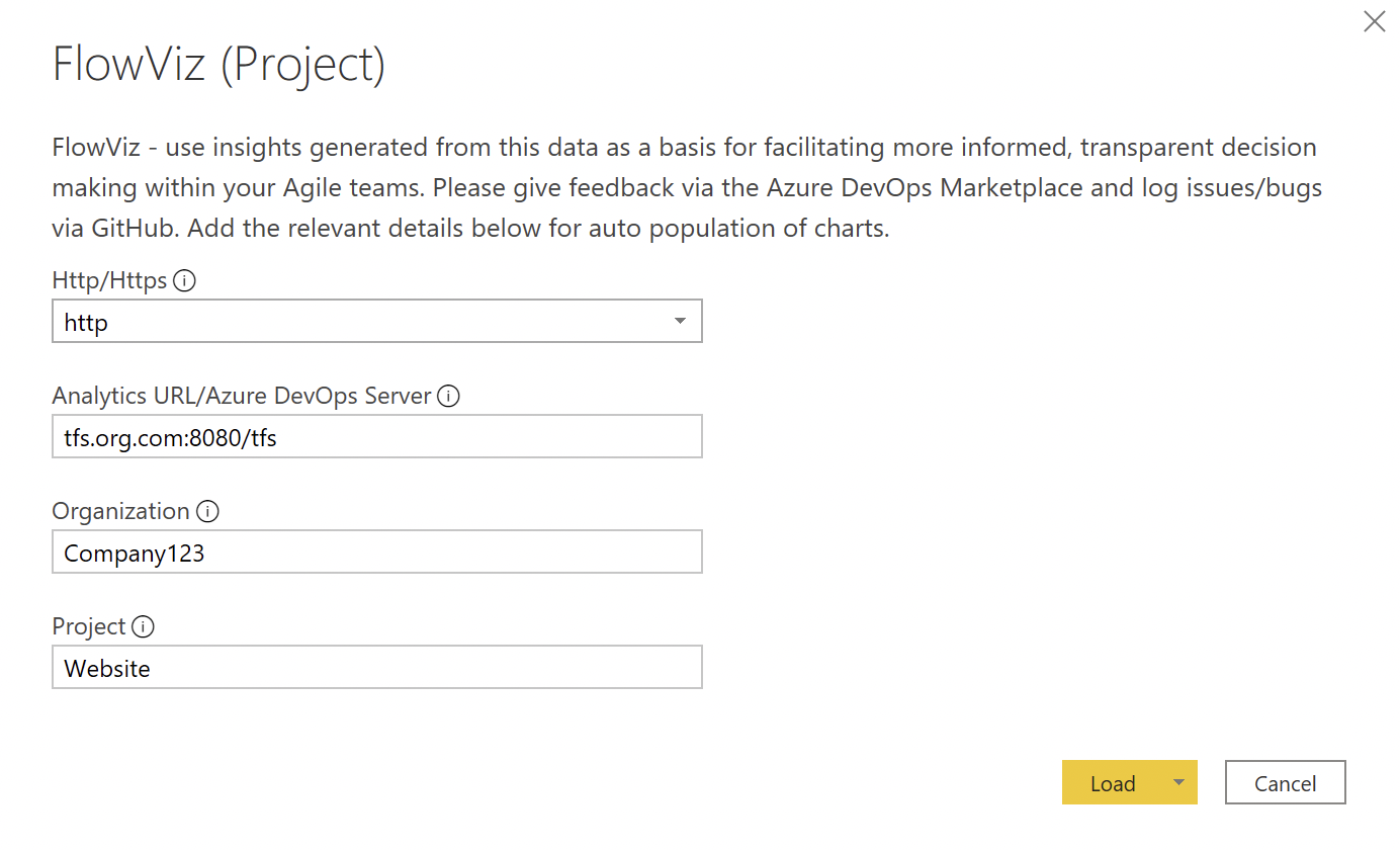
Yes! When you are entering your Analytics URL/Azure DevOps Server value, be sure to add /tfs into this parameter.
For example if your TFS server is http://tfs.org.com:8080/tfs/Company123/Website/
You would need to enter:

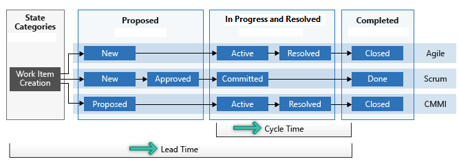
Lead time measures the total time elapsed from the creation of work items to their completion. Cycle time measures the time it takes for your team to complete work items once they begin actively working on them. The following diagram illustrates how lead time differs from cycle time in the context of Azure DevOps.
Lead time is calculated from work item creation to entering a completed state. Cycle time is calculated from a work item first entering an In Progress state to entering a Completed state.
Velocity (sum of effort/story points) is a metric that is easily abused/gamed and, through my years as a practitioner, I’ve found it to be pretty useless as a metric. It forces teams to focus too much on ‘getting our points up’ or just artificially inflating estimates and thus ‘increase velocity’. Countless studies (including my own) have proven that there is little/no correlation in points estimation, and that it is no better than using count of items (otherwise known as Throughput). Plus, Senior Managers and Executives don’t want to hear about story points, they want a language that makes sense, not some obscure voodoo :) This dashboard is all centred on flow and transparency, in a language that is simpler to digest, hence why velocity is excluded.
The Blockers page only works if work items are 'tagged' as Blocked OR if you use the 'Blocked' field in an inherited process template. Any other custom ways of identifying blocked work will not work.
Yes - please check out this thread for guidance on how to do so.
Sprint/iteration data is available in the WorkItems Completed and WorkItems In Progress (WIP) tables, feel free to add to your charts if it helps!
Technical data (builds, releases, pipelines, etc.) is available in v3.0 of the Odata API. However, in their current format I’ve found it to be limited in the value it can bring. You can bring them in as additional tables if you wish (follow steps 1-6 for how to do this)

However if you’re looking for things such as the DORA software delivery performance metrics (Lead time for changes, Deployment frequency, Time to restore service, Change failure rate) these are unfortunately not currently available.
Changing the forecasting visuals is relatively simple to do. Reasons for this could be if you don’t have ‘enough’ data yet but have a reasonable amount, or if you need to "throw away" old data. Just change the 'Input data range' number for the number of weeks worth of data you do want to use. Watch the % stability though!
This isn’t actually true, and a common myth:
-
With 5 samples we are confident that the median will fall inside the range of those 5 samples, so that already gives us an idea about our timing and we can make some simple projections (Source: Actionable Agile Metrics For Predictability)
-
With 11 samples we are confident that we know the whole range, as there is a 90% probability that every other sample will fall in that range (see the German Tank Problem). Knowing the range of possible values drastically reduces uncertainty
To do this there is a slight hack/workaround needed!
- Change the Cycle Time (Calendar Days) under Y-Axis to be Sum or Count

- Go to the Analytics pane

- Expand the percentiles section and modify as necessary

- Go back to the chart layout/fields - change Sum or Count back to Don’t Summarise

