-
Notifications
You must be signed in to change notification settings - Fork 639
New issue
Have a question about this project? # for a free GitHub account to open an issue and contact its maintainers and the community.
By clicking “#”, you agree to our terms of service and privacy statement. We’ll occasionally send you account related emails.
Already on GitHub? # to your account
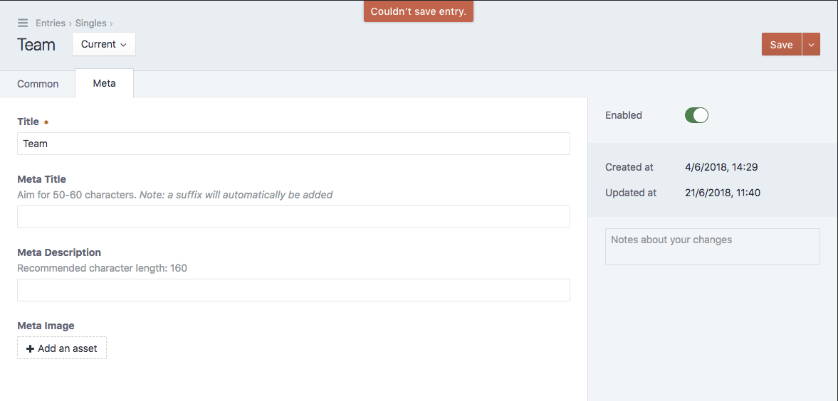
UX: "Couldn't save entry" error is confusing and poor UX due to tabs #3248
Comments
|
@brandonkelly I see. Would it be much work to specify what the error is, or show a less generic error which makes it clear there's invalid content? I also wonder if it's worth maybe having a pulsating/flashing class on the invalid tab or an icon. I'm red/green colorblind and it doesn't stand out too much in the screenshot of yours. |
|
That feels like a duplicate of #1379 so maybe add a 👍 to that issue? |
|
@brandonkelly will do! |
brandonkelly
added a commit
to craftcms/commerce
that referenced
this issue
Sep 7, 2018
# for free
to join this conversation on GitHub.
Already have an account?
# to comment

Description
When saving an entry, a user has complained they cannot save and receive a vague "Couldn't save entry", error message. It is not clear what the issue is as you can see in this screenshot:

It turns out, the error is actually on another tab.

May I suggest the tab with said error is either opened, highlighted or that the error is specifically listed out at the top of the page to give the user more context and help.
Steps to reproduce
Additional info
The text was updated successfully, but these errors were encountered: