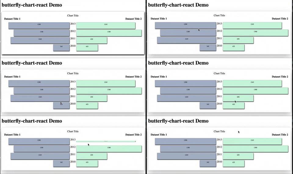
Re-usable Butterfly React Chart Component allows to visually compare bar graph time series data analysis of 2 datasets that represent same period of time.
npm install --save-dev butterfly-chart-react # using npm
yarn add butterfly-chart-react # using yarn
import React, {Component} from 'react';
import {ButterflyChart} from 'butterfly-chart-react';

class App extends Component {

    state = {
        title: 'Chart Title',
        option_select_1: 'Dataset Title 1',
        option_select_2: 'Dataset Title 2',
        highest_value: '',
        data_option_1: [{time_period: '2010', value: '345'}, {time_period: '2011', value: '650'}],
        data_option_2: [{time_period: '2010', value: '345'}, {time_period: '2011', value: '650'}],
        barColor_1: '#aab6ca',
        barColor_2: '#c7f0db',
    }
  render() {
    return (
      <div className="App">
        <ButterflyChart
            title={this.state.title}
            option_select_1={this.state.option_select_1}
            option_select_2={this.state.option_select_2}
            data_option_1={this.state.data_option_1}
            data_option_2={this.state.data_option_2}
            highest_value={this.state.highest_value}
            barColor_1={this.state.barColor_1}
            barColor_2={this.state.barColor_2}
        />
      </div>
    );
  }
}
Please use state as shown above. When using data returned by an API that can be structured very differently, the easiest way would be to loop/map through that data and put it in the similarly structured state.
Additional usage notes:
- Bars flip 180 degrees around x axis upon hovering over
- Add your desired bar colors into the state
- No need to update highest value variable in the state, it gets calculated automatically. Bar size will be calculated automatically as fractions of the highest value for 2 datasets
- Only state needs to be modified in order for chart to be used.

