-
Notifications
You must be signed in to change notification settings - Fork 4
Plots
Hagfish can generate a number of different plots. The most detailed plot of these is:
(Note -there is an older - outdated - script hagfish_cplot, which plots only the ECP)
A cplot2 plot shows all six coverage plots for any given region. The image below, generated from the test set included with the Hagfish distribution, shows a cplot2 plot for a sequence called "contig" starting at position 1 and ending at position 2e5. The image was generated using the following command line:
hagfish_cplot2 -n 6e4 --ymax 200 contig
This specific plot was generated in the course of quality control of a DNA assembly project, meaning that the raw read pairs underlying the assembly were mapped back to the resulting sequence. The following plots are interpreted in this context, but other applications are possible - with (slightly) different interpretations.
Figure 1, Overview cplot2 of a sequence aptly named 'contig'.
The plot ranges from position 0 to 60,000. The plot is compressed into a single "band". It is possible to zoom in and plot data over multiple bands with the following parameters:
-
-s- start of the plotted region -
-e- end of the plotted region -
-n- number of nucleotides per band.
Note - it is possible to define each of these parameters using an exponential format (60,000 can be written as 60e3 or 6e4). So we can zoom in zoom in a on a specific region of the plot using:
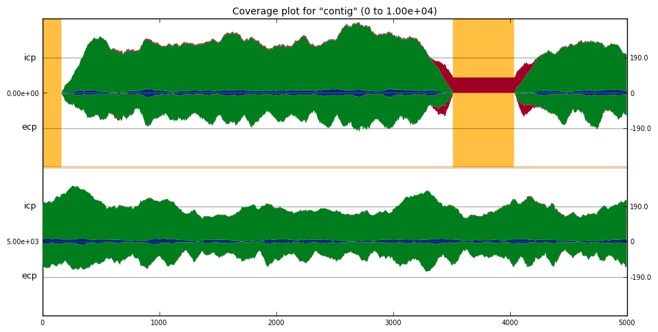
hagfish_cplot2 --ymax 200 -n 5e3 -e 1e4 contig
resulting in the following plot:
Figure 2, Zoomed in on the first 1e4 nucleotides of the plot in Figure 1
The left y axis indicates the start position of that specific band, and the type of plot (ICP or ECP). The right y-axis indicates the scale - with a line drawn at the median ok coverage for that complete sequence (not all analyzed sequences). Above the x-axis are the three stacked, inclusive, coverage plots (ICPs): "high" in red, "ok" in green and "low" in blue. Below the x-axis are the three exclusive coverage plots (ECPs), also stacked (but mirrored) (see Home for an explanation of the differences between ICPs and ECPS and what the three categories mean).
The reference sequence, in this region of the "contig" sequence, contains two gaps (a stretch of NNNs - identified by hagfish_gapfinder) ranging from approximately 0 to 200 and ,500 to 4,100. Gaps are indicated by a yellow background in the plot.
Any region with "sufficient" green ECP coverage (below the y-axis) indicates that that region is completely covered by reads mapping to that region. Any region with "sufficient" green ICP coverage (above the y-axis) indicates that that region is structurally sound, i.e.: based on the read pairs mapped to the genome.
This part of the plot shows two aberrant major features. The first is around 3.5k - the first gap. The ICP shows coverage in the "high" category bridging the gap. The ECP has two small bumps in the "high" category on both sides of the gap. A number of conclusions can be drawn from this signature: it indicates, in this case, that the assembly is correctly scaffolded in this location (i.e. the contigs left & right of the gap belong together), but the size of the gap (the yellow block) is over estimated. This can be concluded by the fact that there is coverage in the ICP spanning the gap (there are read pairs spanning the gap), but they fall in the "high" category - meaning they map further apart than expected - hence, the size of the gap is too large.
hagfish_blockplot is run similar to hagfish_cplot2.
hagfish_blockplot -s 2e4 -e 3e4 -n 2e4 contig
where -s and -e represent start- and end-positions on the contig, and -n sets the number of nucleotides per band.
The same region plotted above is also displayed in the, more compact, plot below:

This plot shows a heatmap, based on the score, and is much better suited to visualize large regions at once. Each of the rows in the plot stands for a region on the contig. Using the bar on the right one can judge the overall quality of the plot - the more the color of the region leans towards -1, the worse the reads map to the region. As in the coverage plot, yellow areas are gaps. Black areas are areas not covered by any reads.
This plot can be used as an indicator of the quality of the assembled region, because the worse reads map, the worse is the quality of the assembly in that region.

