-
Notifications
You must be signed in to change notification settings - Fork 0
Manual of ''Quanto Flx Gadgets'' Package
Tip
Use a widescreen device such as a computer or tablet for better readability.
| Item | Item | Item | Item |
|---|---|---|---|
| Calculator | Calendar | Clock | Desktop |
| Folder Viewer | Gallery | Media Control | RSS |
| Start | Search | Sticky Notes | To-Do List |
| Weather | World Clock |

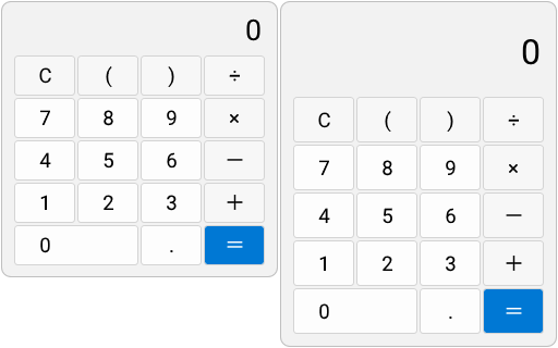
A simple desktop calculator.
Click buttons to enter the formula into the calculator. Click = to display the operation result, and click C to clear the input content.
| Option | Description |
|---|---|
| Copy the Value | Copy the calculation in the calculator. |
| Common Options | Availability |
|---|---|
| Gradient Background | 🟢 |
| Combination | 🟢 |
| Opacity | 🟢 |
| Variable Name | Friendly Option Name | Type | Possible Values | Default | Description |
|---|---|---|---|---|---|
Sound |
Sound | Integer | 0/1 | 1 | This option determines whether the button makes a sound when clicked. |

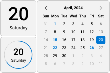
Shows today's date or the calendar for the month.
For 2x2 styles, there are no operations available.
For 4x4 style: Move the cursor to the highlighted date to view the holiday (if "Show Events" is turned on). Press < or slide the wheel up to switch to the previous month, and press > or slide the wheel down to switch to the next month. Click the text of year and month above to switch to today's month.
| Common Options | Availability |
|---|---|
| Gradient Background | 🟢 |
| Combination | 🟢 |
| Opacity | 🟢 |
| Variable Name | Friendly Option Name | Type | Possible Values | Default | Description |
|---|---|---|---|---|---|
StartOnMonday |
Start on Monday | Integer | 0/1 | 0 | Use Monday as the first day of the week. |
ShowEvents |
Show Events | Integer | 0/1 | 1 | If turned off, holidays will not be displayed in the monthly calendar. |
| Friendly File Name | Located in | Description |
|---|---|---|
| List of Events | #Pk@#\Config\SkinSettings\CalendarEvents.xml |
You can find the correct way to edit it in the "Using Event Files" entry in this document. |

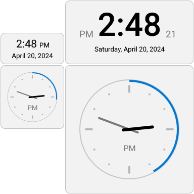
Displays the current time in the form of a digital or skeuomorphic clock.
| Common Options | Availability |
|---|---|
| Gradient Background | 🟢 |
| Combination | 🟢 |
| Opacity | 🟢 |
| Variable Name | Friendly Option Name | Type | Possible Values | Default | Description |
|---|---|---|---|---|---|
Align |
String Align | Selection |
Left - Left Center - Center Right - Right |
Center |
It's about the way the text is arranged. Only available in 2x1 and 4x2 styles. |
AHS |
Always Hide "Second" | Integer | 0/1 | 0 | If not enabled, seconds will only be hidden when Energy-Saving Mode is on. |
AHT |
Hide "AM/PM" | Integer | 0/1 | 0 | Only available in 2x2 and 4x4 styles. |
ScndHnd |
Show Second Hand instead of a Circle | Integer | 0/1 | 0 | Comparison chart here. Only available in 2x2 and 4x4 styles. |
ShowFace |
Show Clock Face | Integer | 0/1 | 1 | Only available in 2x2 and 4x4 styles. |
MainNm |
Number Type | Selection |
00 - None 01 - Western Arabic 02 - Roman 03 - Chinese Double Hour |
00 |
Comparison chart here. Only available in 4x4 style. |
OthrNm |
Display numbers elsewhere | Integer | 0/16 | 0 | Comparison chart here. Only available in 4x4 style. |
Ppos.X.Nm Ppos.Y.Nm
|
Text Position Offset (Horizontal/Vertical) | Integer | Any integer | 0 | If the numbers displayed on the skin are in the wrong position, you can try adjusting these values. Only available in 4x4 style. |

Click to show or hide skins on the desktop.
Click to show or hide skins on the desktop.
Only available in "Customizable Size" style: Drag 
| Common Options | Availability |
|---|---|
| Gradient Background | 🟢 |
| Combination | 🟢 |
| Opacity | 🟢 |
| Variable Name | Friendly Option Name | Type | Possible Values | Default | Description |
|---|---|---|---|---|---|
SPW |
Width | Integer | [2,16] | 4 | The custom width of this skin in "Customizable Size" style. |
SPH |
Height | Integer | [2,16] | 2 | The custom height of this skin in "Customizable Size" style. |
QuickResize |
Enable "Quick Resizing" | Integer | 0/1 | 1 | If turned off, |
Cstm.Im |
Custom icon | String | The path of a local image | #Pk@#Image\Desktop |
- |
ASIIOW |
Always show icon instead of wallpaper | Integer | 0/1 | 0 | - |


Displays the contents of a folder and can interact with files.
This will only work if there are files in the selected folder.
Left-click the icon or name of the file to open it, and right-click to open the menu for operating the file.
When the quantity of files in the folder exceeds the capacity of this panel, you can use the mouse wheel to browse.
Drag 
| Option | Description |
|---|---|
| Open this Folder via Explorer | Use Windows Explorer to open the folder displayed by this Folder Viewer. |
| Common Options | Availability |
|---|---|
| Gradient Background | 🟢 |
| Combination | 🟢 |
| Opacity | 🟢 |
| Variable Name | Friendly Option Name | Type | Possible Values | Default | Description |
|---|---|---|---|---|---|
Path |
Path | String | A local path | %USERPROFILE%\Desktop |
Select a folder you want to display. |
Title |
Title | String | Any text | [Ms.DftTte] |
You can customize the title of this skin. |
Quantity |
Quantity | Integer | [4,32] | 6 | Defines the capacity of this skin. This will determine the size of it. |
AutoQ |
Dynamic Quantity | Integer | 0/1 | 0 | If enabled, this skin will change its size based on the quantity of files in the folder. |
Sc.Cstm |
Scaling (for "Icons" styles) | Floating-Point Number | [1,4] | 1 | It's only available in "Icons" styles. |
IconSize |
Icon resolution | Selection |
Small - 16*16 Medium - 32*32 Large - 48*48 ExtraLarge - 256*256 |
Large |
When this option is adjusted to a too high value, some icons with smaller resolutions will display abnormally. |
ShowFile |
Show files | Integer | 0/1 | 1 | - |
ShowFolder |
Show folders | Integer | 0/1 | 1 | - |
ShowHidden |
Show hidden files and folders | Integer | 0/1 | 0 | - |
ShowSystem |
Show system files and folders | Integer | 0/1 | 0 | "System files" are usually protected and you don't want the user to see them. It is recommended to turn this feature off. |
SortType |
Sorted by ... | Selection |
Name - Name Size - Size Type - Type Date - Date |
Name |
- |
SortDateType |
Sorted by ... date | Selection |
Modified - Modified Created - Created Accessed - Accessed |
Modified |
This option will only take effect when the previous option is set to Date. |
SortAscending |
Sort in ascending order | Integer | 0/1 | 1 | - |
Extensions |
File suffix filter | String | Blank; One or more suffixes | (Blank) | Leave blank to not filter. If you need to filter, fill in the suffix of the specified file type you want to see (e.g. jpg;png). Learn more about it.
|
WildcardSearch |
File name filter | String | Name filter (Required) | * |
Fill in a * to not filter. If you need to filter, fill in the keyword. Wildcards (* and ?) are supported. Learn more about it.
|
HideExtensions |
Hide extensions on display | Integer | 0/1 | 1 | If turned off, files will show their full name. |

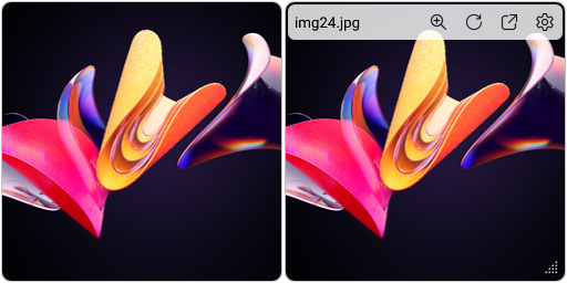
Shuffle images from a folder.
When the cursor is placed over it, the action bar will appear.
Move the cursor to the file name in the upper left corner to display its path and image size.
Clicking the "Zoom" icon will use the image viewer to open the image. Clicking the "Next Image" icon will randomly switch to a picture. Clicking the "Open this folder" icon will open the folder where the picture is located. Clicking the "Settings" icon will open the skin settings.
Drag 
| Common Options | Availability |
|---|---|
| Gradient Background | 🟢 |
| Combination | 🟢 |
| Opacity | 🟢 |
| Variable Name | Friendly Option Name | Type | Possible Values | Default | Description |
|---|---|---|---|---|---|
PW |
Width | Integer | [2,16] | 4 | The custom width of this skin. |
PH |
Height | Integer | [2,16] | 4 | The custom height of this skin. |
PathName |
Referenced Folder | String | A local path | %SYSTEMROOT%\Web\Wallpaper |
Select a folder you want to display. |
Subfolders |
Including Subfolder(s) | Integer | 0/1 | 1 | If turned off, pictures in its subfolders will not be read. |
UpdateDivider |
Update Interval | Integer | [10,86400] | 30 | This option determines how often the image will be changed. |

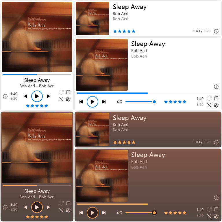
To control your music player in your fingertips.
This skin will only work properly if your music player is playing music and this skin is configured correctly.
When the cursor is moved over it, the skin's appearance will change and some buttons will appear. Below is an explanation of these buttons.
| Icons | Description |
|---|---|
|
|
Play or Pause |
|
|
Previous / Next Track |
| Infomation. Click to copy it | |
| Repeat. Shows only for supported players | |
| Shuffle. Shows only for supported players | |
| Open the player you selected in Skin Settings | |
| Open Skin Settings | |
 |
Like or Dislike. Shows only in certain modes |
 |
Rating. Shows only in certain modes |
| Option | Description |
|---|---|
| Play / Pause | Play or pause. |
| Context | Switch to the next track. |
| Previous | Switch to the previous track. |
| Common Options | Availability |
|---|---|
| Gradient Background | 🟢 |
| Combination | 🟢 |
| Opacity | 🟢 |
| Variable Name | Friendly Option Name | Type | Possible Values | Default | Description |
|---|---|---|---|---|---|
Plugin |
Plugin | Selection |
NowPlaying WebNowPlaying
|
NowPlaying |
This relates to how this skin works. See "Recommended Settings" below for details. |
PlayerName |
Player Name | Selection |
AIMP CAD iTunes Spotify Winamp WMP WLM
|
WMP |
This relates to how this skin works. See "Recommended Settings" below for details. It only works when the "Plugin" is NowPlaying. |
PlayerPath |
Player Path | String | A local path | %ProgramFiles(x86)%\Windows Media Player\wmplayer.exe |
This option determines the executable program that opens when "Open" is clicked. |
AutoGdnt |
Auto gradient background | Integer | 0/1 | 0 | When this feature is enabled, when a cover is read, the color scheme of this skin will be overwritten based on the color of the cover. |
AutoGdntTme |
Preferred color | Selection |
0 - Light 1 - Dark 2 - Simple Light 3 - Simple Dark |
1 |
When the previous option is enabled, this option determines the color scheme used by this skin. |
If you are using the following players, please set "Plugin" to NowPlaying and follow the following settings first:
| If you're using ... | Choose "Player Name" as ... | Limitation |
|---|---|---|
| AIMP | AIMP |
- |
| foobar2000 | CAD |
Plugin required |
| iTunes | iTunes |
- |
| J. River Media Center | CAD |
Must be 19 or higher version |
| Media Jukebox | CAD |
- |
| MusicBee | CAD |
Must be 1.2 or higher version |
| Winamp | Winamp |
- |
| Windows Media Player (Legacy) | WMP |
Cannot switch the status of "Repeat" and "Shuffle" |
Although there is a Spotify option, using the NowPlaying Plugin to control Spotify Client is not recommended. You should use WebNowPlaying Plugin instead of NowPlaying to control it.
When you are using Last.fm Client, TTPlayer (千千静听), OpenPandora or Zune, you can select the WLM option. However, currently both Plugins are not fully adapted to it.
The WebNowPlaying Plugin is only available if you are using Windows 10/11.
You can use WebNowPlaying Plugin when you are using Windows 10 1507 (Original Release, Build 10240.0) or newer Windows and a music player that supports System Media Transport Controls (aka SMTC).
If you are using browser-based players, please install WebNowPlaying Extension for your browser and use WebNowPlaying Plugin. You can view the list of supported sites here.
When using WebNowPlaying Plugin, make sure that only one player is running, otherwise conflicts may occur.
If your music player is not mentioned here, it is not supported by this skin, such as Kugou Music (酷狗音乐), QQ Music (QQ 音乐), etc.

Keep track of the latest news from your RSS feeds.
The content will only be displayed if the network conditions are normal, the target website is a normal RSS feed and the skin is configured correctly.
Click a title to open the pointed website. Scroll the wheel to browse the retrieved titles.
Drag 
| Common Options | Availability |
|---|---|
| Gradient Background | 🟢 |
| Combination | 🟢 |
| Opacity | 🟢 |
| Variable Name | Friendly Option Name | Type | Possible Values | Default | Description |
|---|---|---|---|---|---|
URL |
URL | String | A valid RSS feed URL | (Non-fixed value) | This URL must be an RSS feed that complies with RSS standards and displays at least 15 titles at once. |
Title |
URL Title | String | Any text | (Non-fixed value) | You can customize the title of this skin. |
MoreHeaders |
Grab more Titles | Integer | 0/1 | (Non-fixed value) | If this RSS feed can display 30 or more titles at once, you can turn on it. |
Format |
"Link-at-First" Format | Integer | 0/1 | (Non-fixed value) | If this RSS feed provides entries in a format with links first and titles last, please turn on it, otherwise an exception will occur. |
CodePage |
Code Page | String | Any valid code page identifier | Usually 65001
|
Normally, you don't need to modify it unless it's garbled. |
ProxyServer |
Proxy Server | String | A valid proxy server | /auto |
Normally, you don't need to modify it unless you have special needs. |
UserAgent |
User Agent | String | A valid user agent | Rainmeter WebParser plugin |
Normally, you don't need to modify it unless you have special needs. |


A simple desktop search bar.
Click the skin or press the set shortcut key to activate the text box. Enter what you want to search for and press "Enter" key to view the search results through the browser.
Drag 
| Common Options | Availability |
|---|---|
| Gradient Background | 🟢 |
| Combination | 🟢 |
| Opacity | 🟢 |
| Variable Name | Friendly Option Name | Type | Possible Values | Default | Description |
|---|---|---|---|---|---|
PW |
Width | Integer | [2,16] | 4 | The custom width of this skin. |
QuickResize |
Enable "Quick Resizing" | Integer | 0/1 | 1 | If turned off, |
ScEg |
Search Engine | Selection |
0 - Baidu 1 - Google 2 - Microsoft Bing 3 - Wikipedia 4 - Yahoo! 5 - Yandex |
1 |
Choose a search engine that you commonly use. |
HotKey |
Hotkey | String | A valid key combination | Crtl Alt / |
Separate the two keys with a space. If you do not need to use it, leave it blank. |
Cylindrical |
Cylindrical | Integer | 0/1 | 0 | If enabled, the skin's appearance will become cylindrical. |

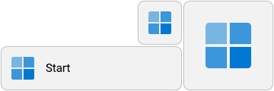
Like the Start button on the taskbar, click to open the Start menu.
Like the Start button on the taskbar, click to open the Start menu.
Only available in "Customizable Size" style: Drag 
| Common Options | Availability |
|---|---|
| Gradient Background | 🟢 |
| Combination | 🟢 |
| Opacity | 🟢 |
| Variable Name | Friendly Option Name | Type | Possible Values | Default | Description |
|---|---|---|---|---|---|
SPW |
Width | Integer | [2,16] | 4 | The custom width of this skin in "Customizable Size" style. |
SPH |
Height | Integer | [2,16] | 2 | The custom height of this skin in "Customizable Size" style. |
QuickResize |
Enable "Quick Resizing" | Integer | 0/1 | 1 | If turned off, |
IconStyle |
Icon Style | Selection |
11 - Windows 11 8/10 - Windows 8/10 7 - Windows 7 0 - Custom Image |
#Sy.Vr# |
The first three icons will be colored according to the Accent Color. If you select "Custom Image", you must select a valid image. |
CstmIm |
Custom Image | String | The path of any image | #@#Image\Null.png |
It only works when the "Icon Style" is "Custom Image". |
FEPWI |
Fill entire panel with image | Integer | 0/1 | 0 | If enabled, the image fills the entire skin. It only works when the "Icon Style" is "Custom Image". |

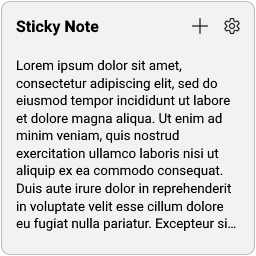
A simple tool for documenting something.
Double-click its contents to edit it. Since its content is stored in a text file, your text editor will open when you start editing.
Important
When you are finished editing, please save it as UTF-8 encoding and then refresh the skin.
Double-click its title to edit it. When you're done editing, press "Enter" to confirm.
Click the "Add Another" button to add another Sticky Note.
Click the "Settings" button to open Skin Settings.
Drag 
Sticky Notes support Quanto Flx Common Text Formats.
Insert the following code into the two ends of the text you want to modify its style, you can get the corresponding style. Nested style is supported. Insert a "\" into the code to escape formatting.
| Code | Description |
|---|---|
// |
Italic text. |
** |
Bold text. |
__ |
Underline text. |
-- |
Strikethrough text. |
`` |
Monospaced text. |
^^ |
Uppercased text. |
@@ |
Tint the text to the accent color. |
@^0 |
Tint the text to the color Black rgb(0, 0, 0). |
@^1 |
Tint the text to the color Red rgb(170, 0, 0). |
@^2 |
Tint the text to the color Yellow rgb(170, 85, 0). |
@^3 |
Tint the text to the color Green rgb(0, 170, 0). |
@^4 |
Tint the text to the color Cyan rgb(0, 170, 170). |
@^5 |
Tint the text to the color Blue rgb(0, 0, 170). |
@^6 |
Tint the text to the color Magenta rgb(170, 0, 170). |
@^7 |
Tint the text to the color Light Gray rgb(170, 170, 170). |
@^8 |
Tint the text to the color Gray rgb(85, 85, 85). |
@^9 |
Tint the text to the color Bright Red rgb(255, 85, 85). |
@^A |
Tint the text to the color Bright Yellow rgb(255, 255, 85). |
@^B |
Tint the text to the color Bright Green rgb(85, 255, 85). |
@^C |
Tint the text to the color Bright Cyan rgb(85, 255, 255). |
@^D |
Tint the text to the color Bright Blue rgb(85, 85, 255). |
@^E |
Tint the text to the color Bright Magenta rgb(255, 85, 255). |
@^F |
Tint the text to the color White rgb(255, 255, 255). |
+-3 |
Smaller text (6.2 pt). |
+-2 |
Smaller text (7.29 pt). |
+-1 |
Smaller text (8.55 pt). |
++1 |
Larger text (11.73 pt). |
++2 |
Larger text (13.7 pt). |
++3 |
Larger text (16 pt). |
The following is a sample text and its rendering effect:
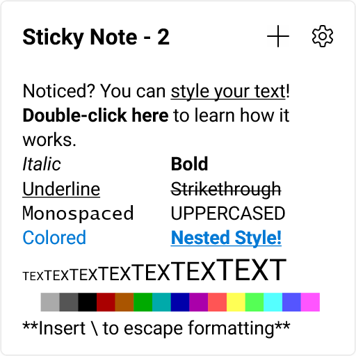
Noticed? You can __style your text__! **Double-click here** to learn how it works.
//Italic//	**Bold**
__Underline__	--Strikethrough--
``Monospaced``	^^Uppercased^^
@@Colored@@	__**@@Nested Style!@@**__
+-3TEX+-3+-2TEX+-2+-1TEX+-1TEX++1TEX++1++2TEX++2++3TEXT++3
@^F█@^F@^7█@^7@^8█@^8@^0█@^0@^1█@^1@^2█@^2@^3█@^3@^4█@^4@^5█@^5@^6█@^6@^9█@^9@^A█@^A@^B█@^B@^C█@^C@^D█@^D@^E█@^E
*\*Insert \ to escape formatting*\*
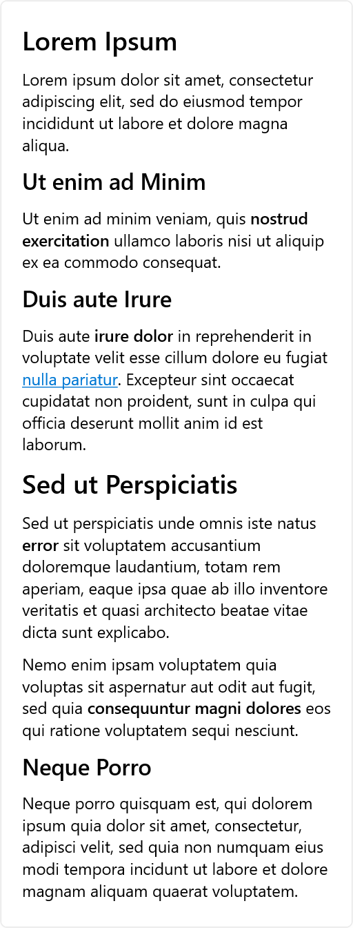
++3**Lorem Ipsum++3**

Lorem ipsum dolor sit amet, consectetur adipiscing elit, sed do eiusmod tempor incididunt ut labore et dolore magna aliqua.

++2**Ut enim ad Minim++2**

Ut enim ad minim veniam, quis **nostrud exercitation** ullamco laboris nisi ut aliquip ex ea commodo consequat.

++2**Duis aute Irure++2**

Duis aute **irure dolor** in reprehenderit in voluptate velit esse cillum dolore eu fugiat __@@nulla pariatur__@@. Excepteur sint occaecat cupidatat non proident, sunt in culpa qui officia deserunt mollit anim id est laborum.

++3**Sed ut Perspiciatis++3**

Sed ut perspiciatis unde omnis iste natus **error** sit voluptatem accusantium doloremque laudantium, totam rem aperiam, eaque ipsa quae ab illo inventore veritatis et quasi architecto beatae vitae dicta sunt explicabo.

Nemo enim ipsam voluptatem quia voluptas sit aspernatur aut odit aut fugit, sed quia **consequuntur magni dolores** eos qui ratione voluptatem sequi nesciunt.

++2**Neque Porro++2**

Neque porro quisquam est, qui dolorem ipsum quia dolor sit amet, consectetur, adipisci velit, sed quia non numquam eius modi tempora incidunt ut labore et dolore magnam aliquam quaerat voluptatem.
| Common Options | Availability |
|---|---|
| Gradient Background | 🟢 |
| Combination | 🟢 |
| Opacity | 🟢 |
| Variable Name | Friendly Option Name | Type | Possible Values | Default | Description |
|---|---|---|---|---|---|
PW |
Width | Integer | [2,16] | 4 | The custom width of this skin. |
PH |
Height | Integer | [2,16] | 4 | The custom height of this skin. |
Color |
Color | Selection |
0 - Default 1 - Yellow 2 - Green 3 - Pink 4 - Purple 5 - Blue 6 - Gray 7 - Charcoal |
0 |
Comparison chart here. |
Ft.Fc.Cstm_Gn |
Font | String | Any font installed in your device | #Ft.Fc.Gn# |
The set font only affects its content. |
SrAl.Gn |
String Align | Selection |
Left - Left Center - Center Right - Right |
Left |
It's about the way the text is arranged. |
HideTitle |
Hide Title | Integer | 0/1 | 0 | If enabled, its content will fill the entire skin. |
| Friendly File Name | Located in | Description |
|---|---|---|
| Contents | #Pk@#Config\SkinSettings\StickyNotes\(Index).txt |
This text file stores the contents of the corresponding Sticky Note. |

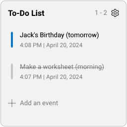
A practical tool for recording matters.
Click "Add an event" to add an event.
When the cursor moves over an event, its appearance changes.
Check the checkbox on the left to indicate "Resolved". Light the star on the left to emphasize the importance of this event. Click the "Delete" button on the right to delete this event.
When the quantity of files in the folder exceeds the capacity of this panel, you can use the mouse wheel to browse.
Drag 
| Common Options | Availability |
|---|---|
| Gradient Background | 🟢 |
| Combination | 🟢 |
| Opacity | 🟢 |
| Variable Name | Friendly Option Name | Type | Possible Values | Default | Description |
|---|---|---|---|---|---|
Quantity |
Quantity | Integer | [1,8] | 3 | Defines the capacity of this skin. This will determine the size of it. |
Title |
Title | String | Any text | #Tm.To_Do_List# |
You can customize the title of this skin. |

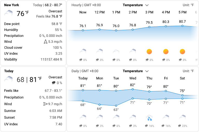
See what the weather looks like around the world.
Information of weather is provided by Open-Meteo.
Place the cursor over the weather icon to see detailed weather conditions for now and throughout the day.
Important
The "Weather - Current" skin should not be refreshed too frequently (such as switching its style, applying global settings, changing its skin settings, etc), as it will likely cause your weather API access limit to be reached, preventing you from getting weather information for that day. Therefore, after loading this skin, it is best not to change the settings frequently or refresh this skin manually. It is also best to unload this skin before modifying the global settings.
| Common Options | Availability |
|---|---|
| Gradient Background | 🟢 |
| Combination | 🟢 |
| Opacity | 🟢 |
| Variable Name | Friendly Option Name | Type | Possible Values | Default | Description |
|---|---|---|---|---|---|
LocationName |
Location Name | String | Any city or region | #Dv.LocationName# |
When you change the location, you will be prompted whether to automatically obtain the latitude and longitude. |
Latitude Longitude
|
Latitude & Longitude | Floating-Point Number | [-90,90] / [-180,180] |
#Dv.Latitude# #Dv.Longitude#
|
You can directly enter the latitude and longitude. This website may be helpful to you. |
IconPack |
Icon Pack | String | The local path of a vaild "Weather Icon Pack" | #Pk@#Image\Weather |
Read it to learn how to make a custom weather icon pack. |
UpdateRate |
Update Rate | Integer | [3600,7200] | 3600 | This option determines how often the data will be updated. |
ProxyServer |
Proxy Server | String | A valid proxy server | /auto |
Normally, you don't need to modify it unless you have special needs. |
Important
These skins are not available when the "Weather - Current" skin is not loaded.
The weather service obtains hourly weather information for a 24-hour period and daily weather information for a 7-day period. Use the mouse wheel to navigate through the weather information.
The 8x4 skin can display line graphs for multiple parameters.
| Common Options | Availability |
|---|---|
| Gradient Background | 🟢 |
| Combination | 🟢 |
| Opacity | 🟢 |
| Variable Name | Friendly Option Name | Type | Possible Values | Default | Description |
|---|---|---|---|---|---|
IconPack |
Icon Pack | String | The local path of a vaild "Weather Icon Pack" | #Pk@#Image\Weather |
Read it to learn how to make a custom weather icon pack. |
Tip
This skin can exist independently, but the settings for longitude and latitude still need to be controlled by the "Weather - Current" skin.
| Variable Name | Friendly Option Name | Type | Possible Values | Default | Description |
|---|---|---|---|---|---|
UpdateRate |
Update Rate | Integer | [3600,7200] | 3600 | This option determines how often the data will be updated. |
ProxyServer |
Proxy Server | String | A valid proxy server | /auto |
Normally, you don't need to modify it unless you have special needs. |
AQI |
AQI calculation method | Selection |
european us
|
Dv.AQI |
Different regions may use different AQI calculation methods. Please choose according to the actual situation. |
Important
These skins are not available when the "Weather - Current" skin is not loaded.
A weather icon pack is a folder that stores icons representing various weather conditions. This folder contains two folders, 0 and 1, representing "night" and "day" respectively, and both folders need to contain the following images:
| Night | Day | File Name | Description |
|---|---|---|---|
00.png |
Clear sky | ||
01.png |
Mainly clear | ||
02.png |
Partly cloudy | ||
03.png |
Overcast | ||
45.png |
Fog | ||
48.png |
Depositing rime fog | ||
51.png |
Light drizzle | ||
53.png |
Moderate drizzle | ||
55.png |
Heavy drizzle | ||
56.png |
Freezing drizzle | ||
57.png |
Heavy freezing drizzle | ||
61.png |
Slight rain | ||
63.png |
Moderate rain | ||
65.png |
Heavy rain | ||
66.png |
Freezing rain | ||
67.png |
Heavy freezing rain | ||
71.png |
Slight snow | ||
73.png |
Moderate snow | ||
75.png |
Heavy snow | ||
77.png |
Snow grains | ||
80.png |
Slight rain showers | ||
81.png |
Moderate rain showers | ||
82.png |
Heavy rain showers | ||
85.png |
Moderate snow showers | ||
86.png |
Heavy snow showers | ||
95.png |
Thunderstorm | ||
96.png |
Thunderstorm with slight hail | ||
99.png |
Thunderstorm with heavy hail |

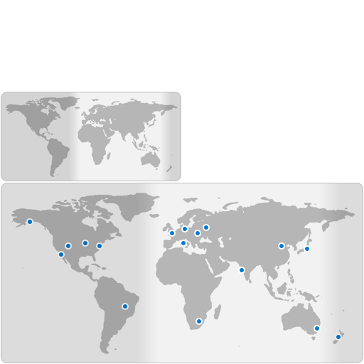
View time around the world.
For 4x2 and 4x4 styles, there are no operations available.
For 8x4 style: Move the cursor over any anchor point on the map to see its local time.
| Common Options | Availability |
|---|---|
| Gradient Background | 🟢 |
| Combination | 🟢 |
| Opacity | 🟢 |


